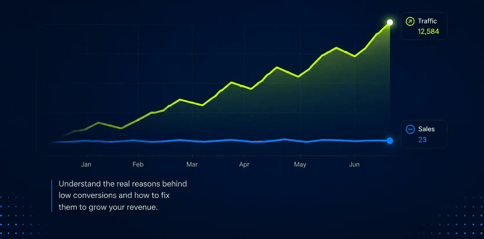
Why Your Shopify Store Gets Traffic But Doesn’t Convert
A better Shopify store does not always need more traffic.
Your product page is where buying decisions are made.
It does not matter how much traffic you generate through SEO, Google Ads, Meta campaigns, influencer partnerships, or email marketing. If visitors arrive on your product page and fail to gain confidence in what they are buying, most of them will leave without completing a purchase.
This is one of the biggest reasons Shopify stores struggle to scale profitably. Store owners often focus on acquiring more visitors while overlooking the page that has the greatest impact on revenue.
The reality is simple: a product page is not just a place to display a product. It is a sales page. Its job is to answer questions, remove doubts, build trust, and guide customers toward a decision.
Over the years, certain mistakes appear again and again across Shopify stores of every size. Some of them seem minor. Others are hidden in plain sight. Together, they create enough friction to quietly reduce conversion rates and leave significant revenue on the table.
Here are seven of the most common Shopify product page mistakes that cost sales.
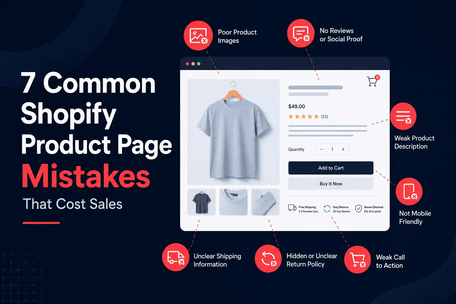
Many Shopify stores approach product descriptions as if they are filling out a product database.
The description lists dimensions, materials, colors, or technical details, but never explains why any of those details matter to the customer.
The problem is that people rarely buy features. They buy outcomes.
A customer purchasing a premium water bottle is not excited because it uses double-wall stainless steel construction. They are excited because their drink stays cold throughout a long workday. Someone shopping for skincare is not interested in a specific ingredient simply because it sounds scientific. They want clearer skin, fewer breakouts, or a more confident appearance.
Features provide information. Benefits create desire.
The strongest Shopify product pages combine both. They explain what the product is while helping customers understand how it fits into their lives.
Whenever possible, product descriptions should answer a simple question:
How does this product improve the customer’s situation?
Stores that answer this effectively often see stronger engagement, longer time on page, and higher conversion rates.
Online shoppers naturally have doubts.
They cannot touch the product. They cannot test it. They cannot ask a salesperson questions in real time.
Because of this uncertainty, people look for reassurance from others who have already purchased.
Reviews, testimonials, user-generated content, customer photos, ratings, and customer stories all help reduce perceived risk.
Unfortunately, many Shopify stores either hide these elements or fail to collect them consistently.
Imagine two identical products sold at the same price.
One has no reviews.
The other has hundreds of customer reviews, detailed feedback, photos, and ratings.
Most customers will choose the second option without hesitation.
Research consistently shows that shoppers actively seek reviews before making purchasing decisions. Social proof acts as evidence that the product delivers what it promises.
The goal is not simply to collect positive reviews. It is to help future buyers feel confident that they are making the right decision.
One of the most common reasons customers abandon purchases is uncertainty.
A customer may love the product, trust the brand, and feel ready to buy. Then a question appears:
“How long will shipping take?”
Or:
“What happens if I need to return this?”
If the answer is not immediately visible, hesitation begins.
Hesitation is dangerous because it gives customers a reason to delay the purchase.
Many stores bury shipping policies inside separate pages, hide return information inside FAQs, or require visitors to search for answers themselves.
High-converting product pages remove this friction entirely.
Customers should be able to understand:
without leaving the product page.
Transparency creates trust. Hidden information creates doubt.
And doubt rarely leads to sales.
In physical retail stores, customers can inspect products from every angle.
Online shoppers cannot.
Your product images are the closest substitute for a real-world experience.
Yet many Shopify stores still rely on low-quality photography, inconsistent lighting, or a small number of images that fail to answer important questions.
Customers want context.
They want to see:
The best product photography does more than showcase the product.
It helps customers imagine ownership.
A shopper should be able to picture themselves using the product before they ever click the purchase button.
When that visualization becomes easier, buying becomes easier.
For most of the Shopify stores today, mobile devices account for the 95% of traffic.
Yet countless product pages are still designed primarily with desktop users in mind.
What looks clean and spacious on a laptop often becomes frustrating on a smartphone.
Important information may appear too far down the page. Buttons may be difficult to tap. Images may load slowly. Popups may block content entirely.
These issues seem small individually.
Collectively, they create friction that hurts conversions.
Mobile shoppers behave differently from desktop shoppers. They scroll quickly, make decisions faster, and have far less patience for poor experiences.
If customers cannot easily find information or complete actions with minimal effort, they leave.
The highest-performing Shopify stores treat mobile as the primary experience rather than a secondary consideration.
Because increasingly, that is exactly what it is.
A surprising number of product pages make customers work harder than necessary.
The Add to Cart button may blend into the design. The product page may contain multiple competing actions. Important purchase options may be buried below lengthy content sections.
Strong product pages create clarity.
Customers should immediately understand:
The call-to-action should feel obvious, not hidden.
Color contrast, placement, spacing, and hierarchy all play a role in directing attention.
This does not mean using aggressive tactics or overwhelming visitors with oversized buttons.
It means creating a buying experience where the next step feels natural.
When customers feel confident and the path forward is clear, conversions improve.
Every customer arrives with questions.
Some wonder whether the product is worth the price.
Others question quality, sizing, compatibility, durability, or delivery times.
Many Shopify product pages focus entirely on promoting benefits while ignoring concerns.
This is a mistake.
The strongest sales pages proactively address objections before customers raise them.
For example:
If customers frequently ask about sizing, provide detailed sizing guidance.
If delivery speed is a concern, explain shipping timelines clearly.
If the product costs more than competitors, explain why.
When objections remain unanswered, customers look elsewhere for information.
Often, they never return.
When objections are addressed directly, customers move forward with greater confidence.
And confidence is one of the strongest drivers of conversion.
Most Shopify stores do not have a traffic problem.
They have a conversion problem.
A product page that converts at 2% and a product page that converts at 3% may not seem dramatically different at first glance.
However, that 1% increase can represent a 50% increase in sales without spending an additional dollar on advertising.
That is why product page optimization is often one of the highest-return activities available to eCommerce brands.
Better descriptions.
Stronger social proof.
Clearer shipping information.
Improved photography.
Better mobile experiences.
Stronger calls-to-action.
Reduced customer objections.
None of these changes require more traffic.
They simply help existing traffic convert more effectively.
Your Shopify product page is not a catalog entry.
It is your salesperson.
It must answer questions, build trust, reduce uncertainty, and guide customers toward a purchase.
The stores that consistently outperform competitors are not always the ones with the largest marketing budgets. More often, they are the ones that make buying easier.
If your store is getting traffic but sales are not growing as expected, start by reviewing your product pages.
You may discover that the biggest opportunity for growth is not attracting more visitors.
It is converting more of the visitors you already have.
A better Shopify store does not always need more traffic.