7 Common Shopify Product Page Mistakes That Cost Sales
Store owners often focus on acquiring more visitors while overlooking the page that has the greatest impact on revenue.
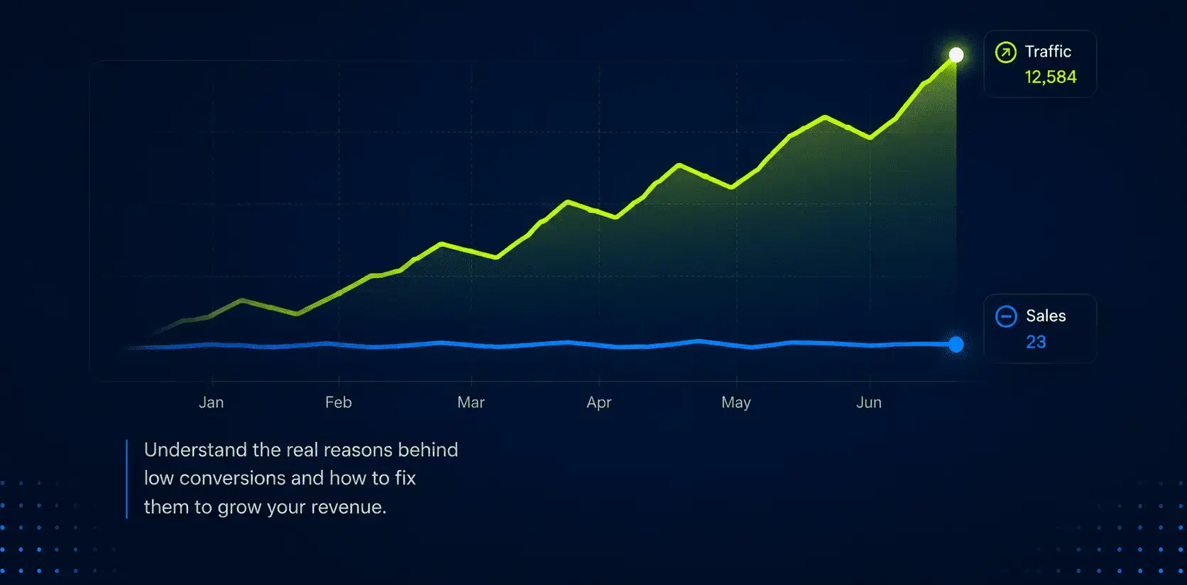
One of the biggest misconceptions in eCommerce is that more traffic automatically leads to more sales.
A store owner checks their analytics, sees hundreds or even thousands of visitors coming in every month, and immediately assumes the next step is to spend more on ads. The logic seems reasonable: if 1,000 visitors generate a handful of sales, surely 10,000 visitors should generate ten times more.
In reality, that is rarely how growth works.
Many Shopify stores are not struggling because they lack traffic. They are struggling because the traffic they already have is not converting efficiently. Visitors are arriving on the website, browsing products, exploring collections, and then leaving without taking action. More traffic simply means more people entering the same leaky funnel.
This is why two stores in the same industry can spend similar amounts on marketing and produce completely different results. One store turns visitors into customers consistently, while the other watches potential buyers disappear at every stage of the journey.
Before increasing your advertising budget, it is worth asking a more important question: what happens after people land on your store?
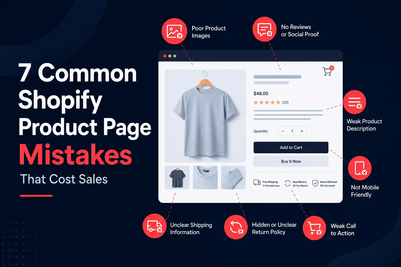
A product page is often the most important page on an eCommerce website. It is the place where curiosity turns into consideration and consideration turns into a purchase.
Yet many Shopify stores treat product pages as simple catalog entries. They upload a few photos, write a short description, add a price, and expect customers to make a buying decision.
The problem is that customers are naturally skeptical, especially when they are discovering a brand for the first time. Unlike a physical retail store, they cannot touch the product, inspect the materials, or ask questions face-to-face. Every piece of information they need to make a decision must be communicated through the page itself.
When key trust-building elements are missing, uncertainty takes over.
Customers want to know whether the product has worked for others. They want to understand delivery timelines before placing an order. They want reassurance that returning the product will not become a frustrating experience. They want clear answers to common questions before committing their money.
A surprising number of stores fail to provide this information.
Instead of guiding visitors toward a purchase, they force them to search for answers. Every unanswered question becomes another reason to postpone the decision. Most customers do not come back later. They simply move on to a competitor that makes them feel more confident.
Trust is not built through design alone. It is built through clarity, transparency, and proof. Reviews, FAQs, shipping information, return policies, guarantees, and user-generated content all contribute to reducing the perceived risk of buying.
The strongest-performing Shopify stores understand this. Their product pages are designed not only to showcase products but also to remove doubts.
Speed is one of the most underestimated conversion factors in eCommerce.
Store owners often evaluate their websites using high-speed office internet, modern devices, and browser sessions that have already cached parts of the website. Customers experience something completely different. They might be browsing on mobile data, switching between apps, or viewing the store on an older device with limited processing power.
What feels fast to the store owner can feel painfully slow to a customer.
Research from Google has consistently shown a strong relationship between page speed and abandonment rates. As loading times increase, the likelihood of visitors leaving before interacting with the page rises dramatically. Even small delays can create friction, particularly during the first impression.
The causes of slow Shopify stores are usually predictable.
Many stores install dozens of apps over time without removing unused ones. Others upload oversized images directly from photographers without optimization. Some rely on heavily customized themes that include scripts and features that are rarely used but still load on every page.
The result is a website that appears visually impressive but performs poorly where it matters most.
Speed is not simply a technical metric. It directly affects user experience. A slow product page reduces engagement. A slow collection page reduces browsing. A slow checkout increases abandonment.
When customers feel friction, they rarely stop to analyze why. They simply leave.
Most Shopify traffic today comes from mobile devices.
Yet many stores are still designed as though the desktop experience is the primary experience.
This creates a significant disconnect between how the website is built and how customers actually interact with it.
A page that looks polished on a laptop can become frustrating on a smartphone. Navigation menus may require too many taps. Product images may push important information below the fold. Popups may cover large portions of the screen. Buttons may be difficult to tap accurately.
Individually, these issues seem minor.
Collectively, they create enough friction to reduce conversion rates significantly.
Mobile users behave differently from desktop users. They scroll faster, have less patience, and are often distracted by notifications, messages, or other apps competing for their attention. If the buying journey is not effortless, they abandon it.
The best-performing Shopify stores prioritize mobile usability from the beginning. They focus on clear navigation, fast loading times, concise product information, and checkout experiences that require minimal effort.
A mobile-first approach is no longer optional. It is the standard customers expect.
Many Shopify stores function like digital catalogs.
They display products effectively, but they do very little to persuade visitors to take action.
Selling online is not simply about presenting inventory. It is about guiding customers through a decision-making process.
Every page should answer a specific question.
Why should I trust this brand?
Why is this product different?
Why should I buy now instead of later?
Why should I choose this over a competitor?
When stores fail to answer these questions, visitors remain stuck in evaluation mode.
Strong eCommerce experiences create momentum. They use trust signals, social proof, product education, and thoughtful page structure to move visitors naturally toward a purchase.
Weak experiences leave customers to figure everything out themselves.
The difference is often reflected directly in conversion rates.
Imagine a Shopify store receives 1,000 visitors.
Out of those visitors, 80 add a product to their cart.
Fifteen begin checkout.
Five complete a purchase.
Most store owners look at the five sales and conclude they need more traffic.
The smarter question is why 995 visitors failed to become customers.
Would it be more profitable to double advertising spend and bring another 1,000 visitors?
Or would it be more profitable to improve the customer journey so that ten or fifteen customers complete a purchase instead of five?
In many cases, improving conversion rate produces faster and more sustainable results than increasing acquisition budgets.
Traffic amplifies whatever experience already exists.
If the experience is weak, more traffic simply amplifies inefficiency.
The good news is that conversion problems are rarely invisible.
Modern tools make it possible to understand exactly how visitors interact with a Shopify store.
Heatmaps reveal where users click and how far they scroll.
Session recordings show where visitors hesitate, become confused, or abandon pages.
Shopify Analytics helps identify high-exit pages and underperforming products.
GA4 provides visibility into the entire customer journey, making it easier to understand where drop-offs occur between product views, add-to-cart events, checkout starts, and completed purchases.
The goal is not to collect more data.
The goal is to understand why customers behave the way they do.
When that becomes clear, improvement opportunities become much easier to prioritize.
A better Shopify store does not always need more traffic.
In many cases, it needs better product pages, faster performance, a stronger mobile experience, and a buying journey that helps customers feel confident in their decision.
The brands that grow consistently are not always the brands spending the most on acquisition. More often, they are the brands that remove friction, build trust, and make purchasing feel effortless.
Before increasing your marketing budget, take a closer look at what happens after visitors arrive.
You may discover that the biggest opportunity for growth is already sitting inside the traffic you have today.
Store owners often focus on acquiring more visitors while overlooking the page that has the greatest impact on revenue.